Creating a Risk Matrix in R
NASA Risk Matrix
Whenever program or project risk is being identified, it is a common practice at NASA, like many other organizations to use a 5 X 5 risk matrix with a green, yellow, red coding for visualization of the risk. Recently a colleague asked for help in visualizing the matrix in Excel. She wanted assistance in pivot tables, sorting, macros and chart building. Stop the insanity.
Below is my quick attempt in creating a risk matrix in R. This post is more about creating the graph and not the short coming, as I see it, in how the matrix data is developed. We will leave that discussion for another time.
In the hopes of making it simple for the user, I began by trying the plotly add-in for Excel. Turns out, the add-in does not have a heat map option, or I just missed it.
Then I tried plotly in R, I could not get the RdYlGn color scheme from the RColorBrewer to work. Again,
more than likely my inabilities. I will keep learning.
I went back to ggplot2 to make this graph. The code is below.
Risk Matrix Using ggplot2
I created a 5 X 5 matrix to hold dummy data. I then melted the data into another dataframe to hold the
Consequence and Likelihood values, then created a new column to hold the sum of the two. This value
will be used to fill the graph with the RdYlGn color palette I stored in myPalette.
# Add libraries used
library(XLConnect)
library(RColorBrewer)
library(reshape2)
library(dplyr)
library(ggplot2)
library(knitr)
# Create the matrix to for the heat map
nRow <- 5 #9
nCol <- 5 #16
m3 <- matrix(c(2,2,3,3,3,1,2,2,3,3,1,1,2,2,3,1,1,2,2,2,1,1,1,1,2), nrow = 5, ncol = 5, byrow = TRUE)
myData <- m3 #matrix(rnorm(nRow * nCol), ncol = nCol)
rownames(myData) <- c("5", "4", "3", "2","1") #letters[1:nRow]
colnames(myData) <- c("1", "2", "3", "4","5") #LETTERS[1:nCol]
# For melt() to work seamlessly, myData has to be a matrix.
# Tidy up the data for processing. The longData dataframe is used to set the colors for the heat map
longData <- melt(myData)
colnames(longData) <- c("Likelihood", "Consequence", "value")
longData <- mutate(longData, value = Consequence + Likelihood)
# Create the Color Pallete
myPalette <- colorRampPalette(rev(brewer.pal(11, "RdYlGn")))
Read the Data
Now that I have the basics of the risk matrix set up, I import the risk data from excel and filter for only the risks I want to display. After some other cleaning up, the data is ready to use.
# Read in the Risk Data from the excel file
risk_data <- data.frame
risk_data <- readWorksheetFromFile("~/OneDrive/GitHub/davidmeza1.github.io/_drafts/RisksForDavid.xlsx", sheet = "DATA")
# Filter the risk data for only those you want to display
display_risk <- filter(risk_data, DisplayOnGraph. == 1) %>%
arrange(CurrentConsequence, CurrentLikelihood)
# Change the variable name for the plot and add the value column
display_risk <- rename(display_risk, Consequence = CurrentConsequence, Likelihood = CurrentLikelihood)
display_risk <- mutate(display_risk, value = Consequence + Likelihood)
View the data
Here is what the data looks like.
head(display_risk)
## Consequence Likelihood OldConsequence OldLiklihood Future.Trend Division
## 1 2 2 2 2 0 ASTRO
## 2 2 2 2 2 0 HELIO
## 3 2 3 2 3 0 ASTRO
## 4 2 4 2 4 0 HELIO
## 5 2 4 2 4 0 PSD
## 6 3 2 3 2 -1 PSD
## ID Title Approach DisplayOnGraph. CurrentSignificance
## 1 ID-7 Test7 M 1 4
## 2 ID-23 Test23 M 1 4
## 3 ID-6 Test6 M 1 5
## 4 ID-22 Test22 M 1 6
## 5 ID-39 Test39 W 1 6
## 6 ID-42 Test42 W 1 5
## OldSignificance value
## 1 4 4
## 2 4 4
## 3 5 5
## 4 6 6
## 5 6 6
## 6 5 5
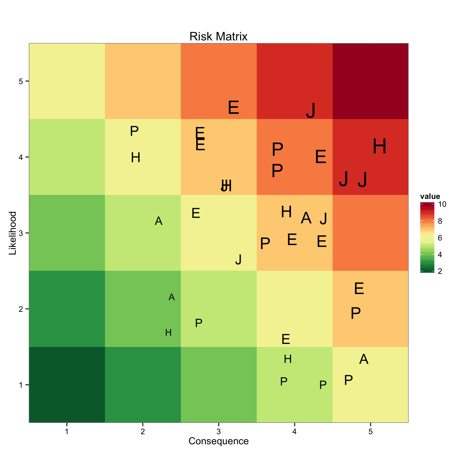
Plot the Graph
Using ggplot, I pass the longData dataframe and use value to fill the graph with myPalette. Then
geom_point() is used to add the risk in the appropriate quadrant, using its value to size the label
generated by the Division column. There it is, simple and easy to do, avoiding all of those excel
headaches. The next step is to make this dynamic and show risk information when a label is selected.
# Create the Heat map to hold your risk
zp1 <- ggplot(longData,aes(x = Consequence, y = Likelihood, fill = value))
zp1 <- zp1 + geom_tile()
zp1 <- zp1 + scale_fill_gradientn(colours = myPalette(10))
zp1 <- zp1 + scale_x_continuous(breaks = 0:6, expand = c(0, 0))
zp1 <- zp1 + scale_y_continuous(breaks = 0:6, expand = c(0, 0))
zp1 <- zp1 + coord_fixed()
zp1 <- zp1 + theme_bw()
zp1 <- zp1 + geom_point(data = display_risk, position = "jitter", size = display_risk$value, shape = display_risk$Division)
zp1 <- zp1 + ggtitle("Risk Matrix")
print(zp1)